Category Archives: Lesson

Autofocus and Portraits

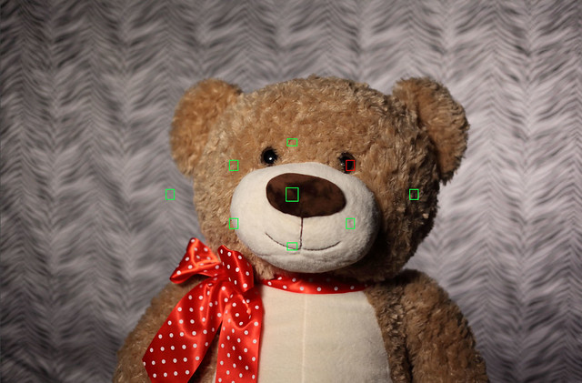
I want to talk specifically about autofocus when shooting portraits. To start off, let’s go back to the teddy bear portrait studio that I set up recently and look at a couple of example shots.

NoseFocus_f2

EyeFocus_f2

If you’re like most people, you’ll perceive the second image as being better than the first… the first one will probably seem like it’s not quite right, even if you can’t put your finger on why. Since this is an essay about focus, though, you probably spotted the difference pretty quickly– in the first image, the bear’s eyes are slightly out of focus, while in the second one they’re sharp.

As I mentioned earlier, shooting portraits can be tricky when you’re using your camera’s autofocus. Portraits are often shot with a fairly shallow depth of field, since you want your viewer’s attention to be on your subject and not on the godawful tiger-striped background that you’ve posed them against. (Again, don’t do that.) It’s extremely important that the subject’s eyes be in focus for portraits, because… well, because I said so and because every other photographer does too.

Here are a couple of closeups that illustrate the difference in my bear images.

NoseFocus_eye EyeFocus_eye

In the image on the left, the nose is in clear focus, but the eye is blurry. On the right, the eye is in sharp focus but the nose is a little bit soft. Why the difference?

In the first image, I just let the camera pick its own focus point. It naturally gravitated toward the center of the image, found a nose that it could grab onto, and used that as the focus point. That’s great if you happen to have a weird fetish for noses, but it’s not great for portraits. In the second image, I told the camera that I wanted to use a specific autofocus point only, and then plunked that focus point right on the bear’s eye. Voila! I got exactly the shot I wanted.

If you can put a focus point right on one of your subject’s eyes, then do that. Some cameras have only one or a few autofocus points. Others, mostly high-end cameras, have eleventy billion of them scattered across the image. (IF you want to see this carried to an extreme, check out the 61 autofocus points on the Canon 5D Mark III. Also, if you’d like to give me one I will be happy to put each and every one of those autofocus points to good use.) As always, check your camera’s manual to figure out how to choose individual focus points, as the controls can vary quite a bit between manufacturers and even between different cameras from the same manufacturer.

If you can’t find an autofocus point that works, then you’ll just have to resort to manual focus. By now you probably know that it’s not so scary. Just flip the camera into manual focus mode, then turn the dial until you get what you want.

Thus endeth my wisdom about focusing for shooting portraits. I have one other topic to cover before I put autofocus to bed, but I’ll save that for another day.

Leave a comment

Filed under Autofocus, Lesson

What to do when autofocus deserts you

You’ve framed your image. You’ve pressed the shutter button and taken the shot. You quickly review the image on the camera and find out that your subject is horribly out of focus. What do you do? You have a few different tools at your disposal for showing the camera that you’re the boss of it, and different ones are useful in different situations.

50mm f/1.8 Manual Focus The first thing you can do is switch to manual focus mode. That’s probably really obvious, but if you’re in the habit of relying on autofocus for everything it might not occur to you that you can do it yourself. Flip the lens or camera into manual-focus mode (depending upon your camera), then grab the focus ring and twist it until you get exactly what you want. If you’re using a zoom lens you might find yourself habitually grabbing for the zoom ring rather than the focus ring, but practice a few times and you’ll eventually start getting the right one automatically.

The advantage of manual focus is that you’re in complete control of the focus. The downside is that it’s sometimes hard to tell when your image is precisely in focus. This is especially true with cropped-sensor cameras that have smaller viewfinders. Many cameras will light up a focus point when that part of the image is in focus even when you’re using manual focus, so you might be able to use that as a guide.

If your image is static, you can use the camera’s LCD as an assistant. Focus, take a shot, then view the image on your camera’s LCD screen. Zoom in on it and scroll around to see if the right parts of it are in focus. If not, correct the focus and try again. (In a competition between film and digital, film would lose hard on this point.)

Many lenses have distance scales on the barrel. If you know that your subject is six feet away from the camera then just turn the focusing ring on the lens until it’s focused at a distance of six feet. Voila!

The second thing that you can do is to use autofocus, but give your camera some extra guidance about what to focus on. Almost all cameras will let you choose one specific autofocus point rather than letting the camera pick its own. If you’re shooting a portrait, for example, you could choose an autofocus point that’s right over one of the model’s eyes. If you do that and the camera can find focus, then you’ll probably get the shot that you’re looking for.

Consult your camera’s manual for specifics of how to choose a focus point, since this can vary quite a bit between makes and models.

There’s a third strategy that will work well in some situations, but it’s a little bit tricky and doesn’t always get what you’re looking for. It’s called focus and recompose.

Imagine that you’re shooting an image with your subject in the bottom right corner of the frame, and your camera won’t focus on it naturally. With focus and recompose you point your camera directly at your subject, then press the shutter button halfway down so that the camera focuses on your subject. Keep holding the shutter button down while you move the camera back to the composition that you want, then take the picture.

Sometimes this works. It will probably do OK if you’re using a narrow aperture and therefore have a lot of depth of field. If you’re shooting a portrait, or shooting with the lens wide open, you probably won’t get what you’re looking for. Explaining why this is would require you to remember some of your high school geometry and do some math, so I won’t explain the details here. The short answer is that when you move the camera you’re changing the distance to your subject ever so slightly, and that might be enough to make your subject go out of focus.

And there you go– you now have three tricks that you can use for showing your camera who’s boss when you’re trying to focus. I recommend that you go practice each of them, so that you’ll have them ready to go the next time your camera gets some crazy ideas about what to focus on.

Leave a comment

Filed under Autofocus, Lesson

When is autofocus likely to get it wrong?

Most of the time, autofocus will do a really good job of getting your subject in focus. Even though I never put my camera in green box mode anymore, I usually leave autofocus on. I keep an eye on it, though, just to make sure that it’s doing what I want. This is especially true in tricky situations where autofocus might not be smart enough to get me the results I’m looking for.

Here are some situations where just blindly autofocusing might not be your best bet.

Medium f/2

You’re shooting through a fence or other foreground object. If there’s something in the foreground with strong lines, such as a fence, your camera is likely to focus on the foreground object rather than your chosen subject. In this example I’ve manually focused on the container and blurred the fence, but if I’d left it up to the camera I probably would have had a sharp fence and a fuzzy shipping container.

Pistil

Macrophotography. Macrophotography is challenging because you have razor-thin depth of field, so you have to pay careful attention to what parts of the image you want to have in focus. If you let the camera pick out what it wants to focus on, it will probably guess wrong. Serious macrophotographers generally use manual focus for everything.

Copyright Joe Decker, used with permission.

Everything in your image is soft. When everything in your image is cloaked in fog, your camera might not be able to find anything to focus on. This beautiful image from award-winning nature photographer Joe Decker is titled Tree Ballet and Pogonip, and is an excellent illustration of the foggy, soft image. This image is from his series Mono in Winter. See more of Joe’s work at Rock Slide Photography.

Your subject is extremely off-center. Again in Joe’s image, even if the trees hadn’t been shrouded in fog the camera might not be able to focus on them. Autofocus systems tend to be heavily weighted toward the center of the image. If you stick your subject way off in a corner then your camera is probably going to lose this particular game of hide-and-seek.

NoseFocus_f2

You’re shooting portraits. Portraits are often shot with shallow depth of field, but the subject’s eyes should always be in focus. It’s OK for the subject’s nose to be a little bit soft, and the ears can be downright blurry, but the eyes had better be crisp. If you let autofocus have its way then it might decide that it really wants the ears or the shirt or the background to be sharp, and leave the eyes shrouded in some of Joe’s mist. In this particular example, the camera got overly enthusiastic about the sharpness of the bear’s nose.

You’re shooting in low light. Autofocus often has a horrible time finding focus if you’re shooting in very low light. If you can’t see very well, your camera probably can’t either.

Those are some of the key situations where just trusting your camera to get the focus right might not be the best idea. In the next lesson we’ll see what we can do about autofocus problems.

1 Comment

Filed under Autofocus, Lesson

How Autofocus Works, a really simple explanation

In my last article, I posted this photo and asked you to identify what’s wrong with it:

IMG_3750

As it turns out, this is actually a really easy question to answer– the background of the photo is in focus, but the bear isn’t. Now, I’ll be the first to admit that teddy bears are supposed to be fuzzy, but this isn’t the kind of fuzziness that most people have in mind. The more interesting question here is why the camera got the wrong thing in focus. In order to do that, we have to learn a little bit about how autofocus works.

Before we do that, let’s try a little mini-exercise. Pick up your camera. Look through the viewfinder, point it at any interesting subject and press the shutter button halfway. You’ll probably see a display with a bunch of black boxes and some red ones. In this image I’ve colored the black focus points green so that you can see them better. Your camera might only have a few little boxes or it might have lots and lots of them. Those little boxes are called autofocus points:

EyeFocus_focuspoints

So how does autofocus work? It’s a complicated, highly-technical thing, but here’s the simplified one-paragraph version that will tell you most of what you need to know.

When you use autofocus to take a picture, the camera looks at each of the autofocus points and looks for areas of sharp contrast. The camera then changes the focus on the lens just a little bit and checks those points again to see if the contrast is better or worse. It keeps doing this, adjusting the focus a tiny bit each time, until it thinks it has the best focus. Once it does, it takes the picture. There’s a whole lot of black magic going on behind the scenes to make this happen, but that’s the really simple version.

The camera might choose to use all of the focus points if it can. More often, it will use one or a few of them to find the subject. As you’re looking through the viewfinder, the camera will light up an individual focus point if it’s happy with the focus in that area. If your camera is guessing wrong you can boss it around and tell it exactly which points to use, but that’s a subject for a different lesson.

So that’s it– when you autofocus, the camera looks at the areas in the little black boxes and then changes the focus on the lens until it’s happy with the results. That’s not so hard, is it?

2 Comments

Filed under Autofocus, Lesson

When Autofocus Goes Bad

[It’s been a while since I updated Stop Shooting Auto! Too long, in fact. It’s time for me to get back to work, starting now.]

Thus far I’ve written a lot about the things that go into exposure– aperture, shutter speed, ISO. By now you should know a lot about how these things work, what your camera does automatically, and ways that you can be smarter than your camera. If you’re not comfortable with these things yet, go back through the exposure lessons and brush up on the things you’re missing. In particular, at this point you want to have a good handle on aperture and depth of field.

Exposure isn’t the only thing that your camera does automatically though. In almost all circumstances, your camera will also automatically focus for you. This is often a good and wonderful thing, since it makes your life easier, but sometimes the camera gets autofocus wrong. Let’s look at an example.

IMG_3750

This evening I decided to set up the Stop Shooting Auto! Bear Portrait Studio and take some shots. Shooting bears is great for practicing your photographic skills because they’re eminently patient with you and won’t squirm around, fall asleep, or wander off to grab a beer from the ‘fridge.

The setup for the bear portrait studio is pretty straightforward. There’s an extra super ugly backdrop, which in this case is a really tacky sheet hanging from a backdrop stand. In front of that is a bear sitting in a chair. I have a few cheap incandescent lights set up, with two pointed at the backdrop and one on the bear. Finally, the camera is mounted on a tripod. For this example, the camera’s sensor is just under eight feet away from the backdrop. The bear’s eyes are 51 inches from the backdrop. The bear has quite the schnozz on him, as the tip of his nose is four inches in front of his eyes.

(My ethical standards require me to make the following disclaimer: Using a zebra print sheet for a backdrop is a profoundly bad idea, and you shouldn’t do that. Doing so may cause permanent damage to your retinas, or your psyche. Sometimes I think my purpose in life is to serve as a warning for others.)

I’m shooting with a Canon 5D Mark II, and a 50mm f/1.8 lens at f/4.

So, with this setup I took a portrait. Something went horribly wrong, though– the image sucks. Can you guess what the problem was? Click on the image if you want to see larger versions of it.

2 Comments

Filed under Autofocus, Introduction, Lesson

Holiday gifts for the dSLR owner, 2009 edition

Last year I published a list of holiday gifts for your favorite camera owner.  I still love all of those recommendations, but here’s a new list for 2009.

The GorillaPod is an incredibly innovative portable tripod.  It’s small enough to fit into a camera bag or backpack, so your favorite photographer can always have it handy.  The articulating legs allow it to be used as a tabletop tripod, or to wrap around the nearest tree branch, street sign, or whatever else is handy.   While it’s not the only tripod a photographer could ever need, it’s incredibly brilliant at what it does.

There are several models of GorillaPod to choose from.  Be sure to choose one that’s right for the camera it’s being used with.  Many of the smaller GorillaPods are designed for small, lightweight point & shoot cameras, and they won’t do a very good job of holding up a dSLR.  The SLR model is excellent if your photographer friend uses fairly small lenses, but step up to the SLR Zoom model (pictured above)  if they use long lenses, or if you aren’t sure.  A little bit of sturdiness won’t hurt.

In the age of the high-tech digital camera arms race it may seem strange for me to recommend a cheap film camera, but hear me out.

The Holga 120N is exactly that– a cheap Chinese-made plastic film camera.  It’s low-tech.  It leaks light like crazy.  It vignettes, and the cheap plastic lens often distorts like nobody’s business.

And that’s what makes it fun!  Sometimes it’s nice to take a break from the exquisitely flawless photography of the digital age and do something messy and imperfect.  The Holga is the classic camera for that. If you don’t believe me, check out the images in this Washington Post article, including an award-winning photo of Al Gore on the campaign trail.

The basic camera above is a great place to get started.  Amazon also sells a Lomographic Holga Starter Kit, which includes a Holga with built-in colorflash, a book, and a roll of film.

The book Light, Science, and Magic is a little bit more advanced than I would usually recommend here, but I’m doing it anyway. It’s a fantastic book!

Photography is all about capturing light, and Light, Science, and Magic is the best I’ve ever encountered about photographic lighting.  There is plenty of material that is accessible to a beginner, but also enough depth that the book will grow with them over time.   This isn’t just one of the best photography books I’ve ever read, it’s one of the best books on any subject.  Really!

If your photographer friend is still trying to remember that they have to take the lens cap off before they shoot, or most of their pictures come out blurry, this book will be a bit too advanced for them.  However, if they’ve mastered the basics of their camera and seem interested in learning to take better photos, this could be just the book they need.

And finally, one thing photographers like to do is show off their photos.  There are so many digital photo frames on the market that I can’t even begin to recommend a specific one.  You can find some that are keychain-sized, and others that are 17 inches or more.

Happy holidays from Stop Shooting Auto!

Leave a comment

Filed under Equipment, Lesson, Stuff

What is Exposure Compensation?

I have new kittens!

I’m not normally one of those people who takes hundreds and hundreds of pet photos, but I’m not completely immune either.  This evening I turned around and saw them sitting on top of the cat tree looking utterly adorable.  I also happened to have my 5D Mark II sitting on my desk, with a 580EX flash and a Sto-Fen Omni-Bounce diffuser attached.

If you’ve ever been around kittens, you know that they’re not terribly prone to sitting still for very long.  I slapped the camera into P mode, turned the flash on, and started shooting.  After a few shots, I looked at one of the images:

We're cute and underexposed

Yuck! Underexposed. I’d put the camera into P mode because I was in too much of a hurry to think about the proper settings for flash (which I almost never use), but I’d forgotten that the diffuser I was using steals light. You know how frosted glass doesn’t let as much light through as clear glass? The same thing happens with the translucent plastic of the flash diffuser. It does a great job of softening the harsh light of a flash, but it also means that your images will be underexposed if you don’t do something about it.

The kittens were staying put, so I had time to shoot a few more, but I wanted to get a better exposure. I knew from experience that the diffuser reduces light by about one stop, so I used the exposure compensation setting on the camera to overexpose the image by one stop. Actually, I screwed up and set it for one and a third stop of overexposure rather than one stop, but I didn’t notice that until later. The results, while not perfect, were appreciably better:

Hi!  We're cute!

If you look at the full-size version of the image, you can see that there’s actual definition in the black fur.  The white fur is a little bit blown out, but the net result is better than the first one.  I could fix both of these to some extent in Photoshop, but it’s better to get it right in the camera.  I haven’t adjusted the exposure of either of these, though I did crop them and sharpen the second one a bit.

So what is this exposure compensation thing?

Well, we already know that in most modes, including program, aperture priority, and shutter priority, the camera uses its meter to evaluate the image and then picks an exposure based on it.  In manual mode, you do this yourself, though you usually use the meter as a guide.  The camera does this by looking at the average brightness of the image and then picking an exposure that will best capture it.  When using automatic flash, the camera also tells the flash unit how bright it should be.  This often works very well, but in my case I knew something that the camera didn’t– there was a diffuser on the flash.

Exposure compensation tells the camera that it should overexpose or underexpose an image by a certain amount.  In my case, what I said to the camera was, “Hey, camera.  Make your best guess about the exposure, and then add one stop to it.”  I did this by changing the exposure compensation setting to +1 rather than 0.  Doing that allowed the camera to correct for the diffuser, and get a better-exposed image.

The exposure compensation on your camera looks something like this:

-2..1..0..1..+2
       ^

What you’re seeing is a representation of the camera’s meter, and an indicator underneath it showing what the compensation should be.  When the arrow is under the zero, the camera will pick the exposure it thinks is right.  However, when it looks like this:

-2..1..0..1..+2
          ^

the camera will add one stop to the exposure it thinks is right, resulting in a brighter image.  If the arrow was under the 1 on the left, the camera would subtract one stop and the result would be a darker image.

Exposure compensation is useful if you know that the camera is going to predictably underexpose or overexpose an image.  This might happen if you’re shooting with a very light background like snow, or a very dark background like a dark theater.  There are lots of other cases where it can happen as well.

Oh!  One other thing.  Sometimes people discover that their camera is suddenly making all of their pictures too dark or too bright. They wonder what’s wrong, and think their camera is broken.  What has usually happened is that they’ve accidentally set the exposure compensation, and the camera is doing exactly what it was told to.  Also, don’t forget to set it back to zero when you’re done, or your next shoot will have lots of over- or underexposed image.

I hope this helps explain the basics of exposure compensation.

And yes, yes.  I really did admit to using P mode on my dSLR.  As I said above, I didn’t want to think about the right settings for the flash.  I was in a hurry, because I wanted to catch the kittens before they moved.  Plus, I wasn’t really aiming for super high-quality images– in essence, I used four thousand dollars worth of equipment as to grab a quick snapshot.   P is only bad when it’s used for everything, or used without forethought or understanding of its weaknesses.

9 Comments

Filed under Exposure, Lesson

How do I control macro (and other) depth of field?

On a Flickr discussion the other day, someone asked what the best way was to control and improve the limited depth of field when shooting with a macro lens.

Pollen In case you’re not familiar with the term, macro photography is very close-up photography.  Technically, it’s photography where the size of the image on your sensor is at least as big as real life, but most people use the term more loosely.  I’m not interested in picking technical nits here, so I won’t be picky.

If you’ve ever done any macro photography, you know that getting your whole subject in focus can be tremendously challenging.  When you’re shooting macro, your depth of field is extremely tiny, often measured in millimeters or fractions of millimeters.  Just a little bit of movement from you or your subject and everything goes to out-of-focus hell in a windblown handbasket.  Even when you have a perfectly still subject and your camera rests firmly on a tripod, shooting your subject at the wrong angle will get you in trouble.  For an extreme example, check out the larger version of the grains of pollen on the left.  The camera was at a slightly different angle than the pollen, and you can see the changes in focus at the top and bottom of the photo.  (You can also see some excellent examples of sensor dust if you look closely at the top right and bottom left corners.)

Back to our question:  how do you control depth of field when you’re shooting macro?  My response on Flickr was that you do it in exactly the same ways that you do for any other shooting:

  • choose your aperture wisely
  • manage your camera-to-subject distance
  • choose your focal point wisely
  • when you can, use depth of field preview to check your image before you shoot

We should all understand the first one by now– choose your aperture wisely.  If you’re new to Stop Shooting Auto! and you aren’t completely familiar with aperture and how it works, you should go reread this lesson and the few that follow it.  In short, choosing a wide aperture (a low-numbered f-stop like f/4) will give you a very shallow depth of field.  Choosing a narrow aperture (a high-numbered f-stop like f/16) will get you much more depth of field.

Don’t forget that there’s an online depth of field calculator that you can use.  If you click around on that site you can also find a PC version, an iPhone version, a PalmOS version, and several other tasty tidbits.

People often overlook the camera-to-subject distance when they think about depth of field, but it’s a key parameter.  Try pulling up the DOF calculator and enter the following values:

Camera format:  Canon Digital Rebel, XT, XTi, XS, XSi
Focal length: 100mm
Selected f-stop: f/11
Subject distance:  30cm

Note that 30cm is right about one foot.  Click the calculate button, and you’ll see that your depth of field goes from about 29.9cm to 30.1cm, for a total of .26cm.  That’s about two and a half millimeters, which doesn’t leave much margin for error.

Leave everything the same, but change the subject distance to 60cm.  Now, your depth of field is from 59.4cm to 60.7cm, for a total of 1.29cm. That’s still not a whole lot, but it’s almost five times what you had when you were a foot away.  Try it at more normal focusing distances, like ten feet and twenty feet, and you’ll see that even there, doubling the distance between the camera and the subject gives you about a 4x increase in your depth of field.  In short, if you’re having trouble focusing, move back.

IMG_5835Choosing your focal point can make a huge difference when you’re working with limited depth of field.  It’s often true that your camera can do a better job of focusing than you can, but it can’t choose what to focus on.  If you really care about a certain part of the image being in perfect focus, your best bet is to put the lens into manual focus mode and do it yourself.  This will give you absolute control over where you’re focusing.

In this image, letting the camera focus might well have meant that it chose to focus on a deeper part of the spadix (the sticky-outy part for non-botanists), leaving the tip out of focus.  This might have been an interesting effect, but it wasn’t what I wanted.

Don’t forget the depth of field preview button on your camera.  If you have a shot lined up, and you want to see how much of it will be in focus, press the depth of field preview button.  The viewfinder will get darker, sometimes very dark, but if you have enough light on your subject you can probably squint and get a good idea of how much of the image is in focus.

If you just can’t get enough depth of field, there are a couple of things you can do.  First, you can add more light to the subject.  I often use desk lamps for macro work, since I can aim the light wherever I want it.  Flashes are always an option, though they can be challenging to use.  If you’re outdoors, get your subject out of the shadows, or use a white reflector (even a piece of paper will work) to reflect light onto the subject.

Putting your camera on a tripod will let you use a longer exposure, and therefore a smaller aperture.  This only works for subjects that are stationary, though– don’t try it with moving objects or you’ll wind up with a blur.

And finally, if your camera is parallel to your subject it will be easier to get the image in focus.  If your subject is at an angle to the front of the lens, move the subject and/or the camera to get a better angle.  Look up at the pollen photo for an excellent example of what happens when you get this wrong.

While depth of field issues make macro photographers pull their hair out (and then photograph the strands), it’s challenging in lots of other situations as well.  Learn to control it and you’ll have a powerful tool for taking better photos.

Leave a comment

Filed under Aperture, Discussion, Lesson

Histograms: When weird is OK

HazardHistogramIn the last couple of lessons I showed you what a histogram is, and talked about what a good histogram looks like for a typical image. I also showed you a few bad-looking histograms for overexposed and underexposed images.

Sometimes, a strange-looking histogram is actually OK. This happens if the image that you’re capturing has an unusual distribution of levels, such as a lot of very light or very dark areas. It can also occur if you have a very narrow range of colors, or several other things that are out of the ordinary.

Look at the histogram above. It doesn’t look at all like a bell curve, but rather has several fairly well-defined peaks. There might be a little bit of clipping on the left and right, but there might also just be some solid black and solid light-color areas. It’s hard to know for sure from the histogram whether the image is well-exposed or not, but because there’s a good distribution across the range I would guess that it’s probably not too far off.

VegasHistogramAt first glance, this looks like a massively-underexposed image. There’s a huge amount of clipping on the blacks, and what looks like a little bit of clipping of whites as well. On the other hand, it could be an image with fast swaths of black and very dark colors, and a few bright spots.

As luck would have it, both of these images are within shouting distance of being well-exposed.

Hazard Vegas

When we look at the actual images, it’s pretty easy to see why the histograms were weird. The image with spikes has a very distinct color breakdown. I probably could have done a slightly better job with the exposure, but it’s not far off. The image on the right does indeed have vast swaths of black in the form of the night sky and the ground. A few of the highlights are blown out, as we can see at the far right of the histogram, but that’s really hard to avoid when taking pictures of lights against a black background.

What did we learn from this? Well, if I’m any good at all, we’ve learned that you need to consider your subject matter when you’re looking at a histogram and use that to judge what the histogram should look like. I know that sounds impossible, but most of the time it’s actually rather easy to do once you get the hang of it. In fact, here’s one to think about. If you were taking a picture of the full moon at night, what should the histogram look like?

DarkImage

Oh yes. The other day I showed you a histogram with almost all of the pixels left of center and asked what you thought about the exposure. Both Sarah and TJ had excellent things to say about the image, but TJ completely nailed it– “the object… is mostly black.” In fact, it was my black camera bag shot against a dark carpet. There’s a blip at the far right for the embroidery on the logo, but other than that the image is just naturally dark. It was perfectly reasonable to guess that the image was underexposed, but it was sort of a trick question. I’m just mean like that.

Do you feel like you have a good basic understanding of how the histogram works?

4 Comments

Filed under Lesson

What is a good histogram?

In my last entry, I introduced the histogram and described its basic function. I even showed a couple of examples. If you read the entry you should have a good understanding of what a histogram is, but there’s probably a great big question in your mind right now: “What is a good histogram?”

The short answer is that there’s no such thing.

You don’t like that answer much, do you? Nope, me either, so even though I could save myself a bunch of typing I won’t leave it at that. I don’t want people running around saying that I’m a meanie.

GoodFlowerHistogramThe longer answer is that what a good histogram is depends on the subject of your photo. For “typical” images, those with an average range of light and dark areas, a good histogram will basically look like a bell curve that’s centered around the center of the graph. And look! Here’s one now. Isn’t that convenient?

Looking at that histogram, you might conclude that there’s nothing in the image that’s 100% bright white, and a very tiny amount that’s pure black. The photo has a good range of tones from light to dark, and there are more moderately-light pixels than moderately dark ones. Let’s look at the image and see if we’re right.

GoodFlowerHey, we guessed pretty well. The flower has a range of tones from black to nearly-white, and there are pretty big light-colored areas.

Note that the exposure looks pretty good to our eye and on the histogram. There are no areas where it looks like we’ve cut off dark colors and made them black, or lost information because the pixels have become pure white. If we had, you’d see spikes at the left or right side of the histogram.

In general, that’s the mark of a good histogram for a typical, average photo. You generally want the majority of the pixels to be somewhere in the center of the graph, without a lot of stuff piled up on one side or the other. If you’re shooting something that has a significant amount of pure black or pure white in it, you’ll sometimes get a spike on the left or right side. That’s OK, but you’ll probably be OK if most of the pixels are somewhere near the center.

When I shot this flower, I took a bunch of pictures with the lighting changed slightly, and most of them didn’t turn out as good as this one. Let’s look at a couple of bad ones now.

DarkFlower LightFlower

If you’re like me, you’re probably thinking about the three bears right now– “This one is too dark. This one is too light. And this one is juuuussstttt right.” If you look at the bottom right corner of the images, you can see the histograms for them. (Or click for larger versions of the dark and light ones respectively.) The histogram for the dark flower has the whole graph left of center, and there’s a big pile of pixels right up against the left edge.  That means that all of the colors in the image are dark, and the part against the edge shows that there’s a bunch of solid-black pixels.  That’s not good– it means we cut off a bunch of information.

The too-light flower has almost all of its pixels on the right side of the graph, which usually indicates that the image has been overexposed. However, if you look closely you can see that there’s nothing against the right edge of the graph. That’s a good thing– it means that you can probably use an image editing program like Photoshop to fix the image and get something pretty good. The dark image might be recoverable as well, but it will never be as good because some of the information got lost when the picture was taken.

If you’re taking a picture of something that’s mostly black or very bright, or something with a narrow range of brightnesses, a correct histogram may look strange. In my next lesson I’ll show you some examples of those, and answer the question about the all-on-the-left histogram at the bottom of my last entry.

And here’s something for you to practice: get into the habit of looking at your histograms. Take a few pictures, and review them on the camera. Check your manual to see how to view the histogram, but on my Canons I get it by pressing the “Info” button while viewing an image. The best way to get familiar with it– pretty soon you’ll have a good eye for what’s right and wrong.

Leave a comment

Filed under Lesson